THE PROJECT
Neoneli Project – as we called it from the very beginning – has the purpose to reconstruct the historical heritage of a village (Neoneli) and its territory. The goal was to merge meticulous scientific research and common people contribution to share knowledge in a public and open source platform.
THE PROJECT
Why? The village of Neoneli is a passageway in Sardiania. It is in a central and strategical position, crossed by any type of ravelers during centuries, from northern to south, from east to west and vice versa.
A privileged observation place to understand the history of the island.
How? With historical scientific research (sociological analysis, archival study and research, territory use during centuries) and village inhabitants shared in website, used like a ‘hub’ to concentrate all the historical documents, old pictures, videos interviews (with the testimony of the older residents of the village) and motion graphics videos to show the evolution of Neoneli’s territory and toponyms.
Inhabitants contribution:
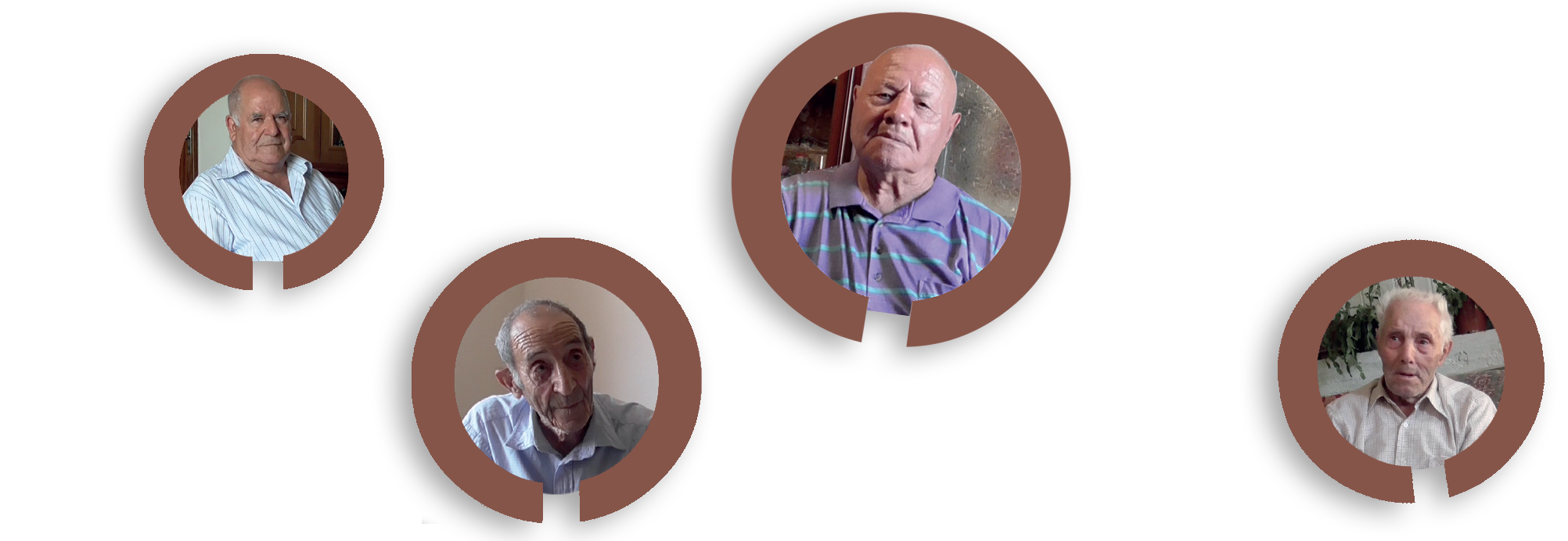
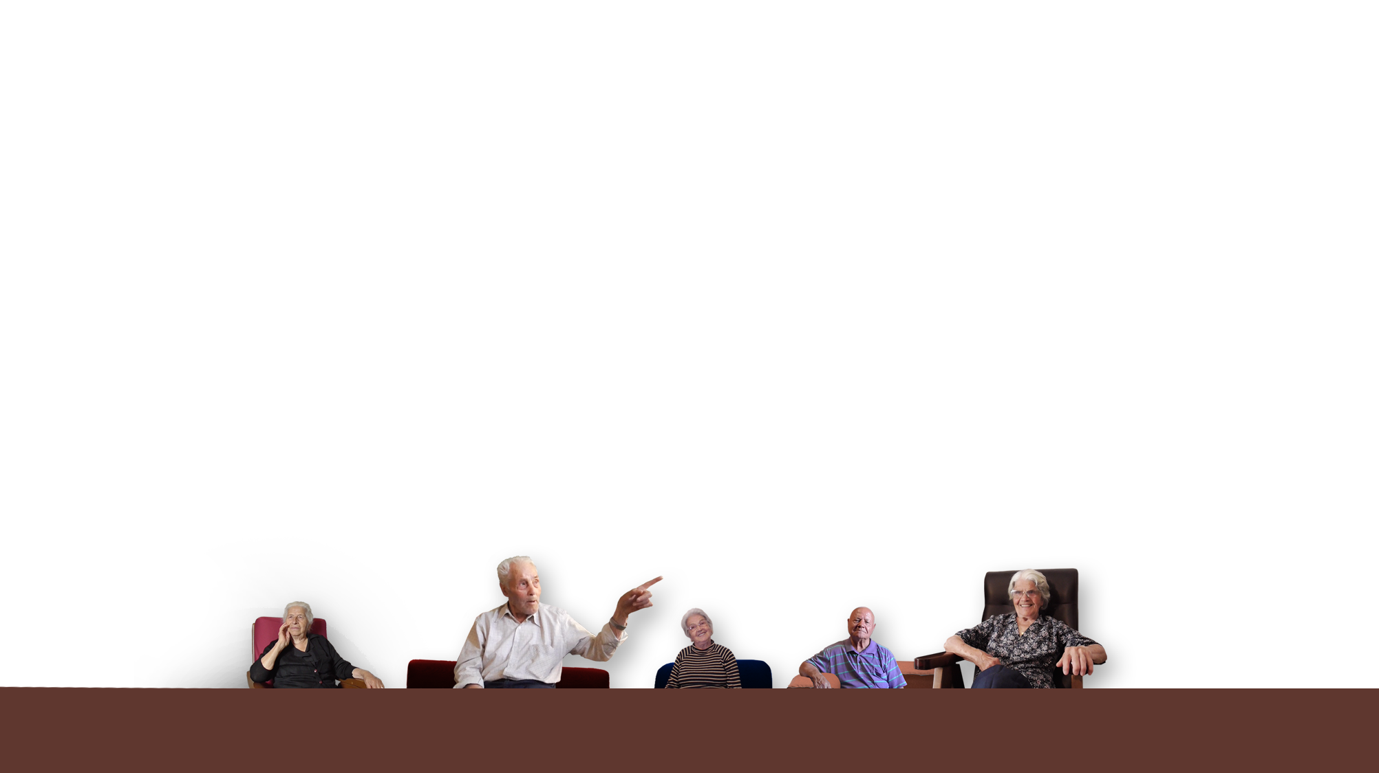
Older people | How does older inhabitants remember main history episodes? What they remember of war? How did technology changed their life? We ask them directly filming that. The where up to 85 to 98 years old. They remember also their parents tales. We collected hours of film with precious informations related to more than a century of history. We observed the different use of toponyms, use of sardinian language (with different accents/words) and how it changed during the time: it was different depending on their job/ age.
Younger inhabitants | Any age inhabitants where all invited to contribute with informations, family pictures and documents archives, sharing them with the community by project web platform.
Team. The project had the scientific direction by the archaeologist Maria Antonietta Mongiu and the sociologist Nicolò Migheli; doctor Enrico Trogu worked on the archival research, architect Miriam Stara reconstruct territory and village evolution during centuries. I was in charged to work on visual designed: website design (with the big help of Enzo Cancemi), project visual identity and motion graphics.
MY WORK
My task was to plan the multimedia design and visual identity for the project. The goal was to design the multimedia platform to place content to be simple, usable, ordinate, recognizable and nice to see. Visual design had to be discreet but with a strong visual identity.
Visual identity
I worked on 4 main concepts:
1. Center | Neoneli village is in central Sardinia, a geographical passageway, cultural and linguistic transition point.
2. Mahogany color | Typical of local stones and cork-oak trees.
3. Work in progress | To add any time new materials/info/docs.
4. Technology | Multimedia design, web platform essential tool.
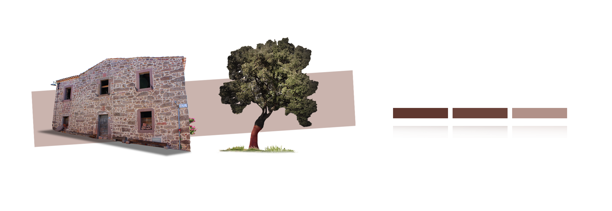

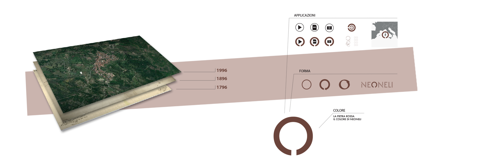
The result is an essential visual design with simple geometric shapes, mahogany color used with gradients and worm-vintage filter for pictures and videos. The circle with non-finished shape become the main sign of visual identity. We used it to remind the charging/download icon animation (work in progress/tecnology), and also the position of the village (Center), and the quite-central ’o’ of the word NeOneli. The non-finished circle was used to make focus on topics or places on a map, as texture and more else.
Videos
There are 2 distinct types f video production: interviews and motion graphics. Interview video quality is rough and intentionally uncut because its purpose is to preserve original material for future scientific study. Animations are designed as an educational fruition tool of the results of scientific research.
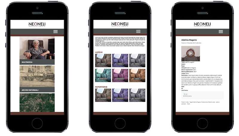
Website
Pictures, videos, documents and social platform connection: that’s ‘Neoneli – Progetto di comunità’ website. It has been designed as a public platform to archive multimedia content. Pinterest and Google Maps where free platforms, to use as part of the website infrastructure: used to let common people, resident of the village, to add and share with the community, pictures and documents found in their private family archives. Website is designed to permit a dynamic navigation. The visitor can decide the level of content fruition, from superficial to scientific.