Autodeterminatzione was a coalition of Sardinian parties who run the Sardinian elections in 2019. It was a plural coalition with different political sensitivity with a progressivist manifesto.
In its values there was individual and national self-determination. Gender equality, social welfare, education, bilingualism and enhancement of Sardinian National identity.
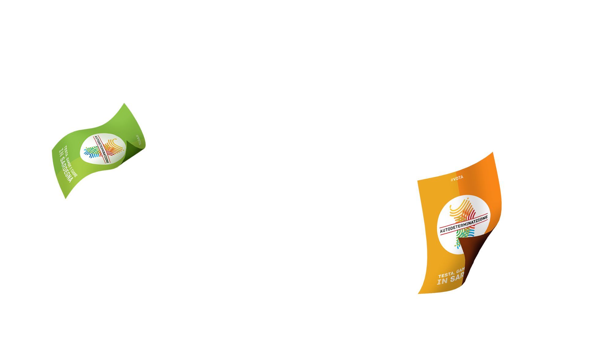
I worked with a preexisting logo. Autodeterminatzione logo represent the shape of Sardinia as a fingerprint made of rainbow colors.
This variety of colors had to represent the plurality of the coalition and also the diverse society we live in, and they want to enhance.
I used this concepts to start my work to make the campaign coherent with the ‘sketched’ visual identity.
In its values there was individual and national self-determination.
There was gender equality, social welfare, education, bilingualism and enhancement of Sardinian National identity.
Visual design challenge
The first problem was to renew the old-fashioned image of the self-determination movement with a fresh and you identity.
The second issue was to show the variety of the coalition without weaken the unitary perception of the public.
Third, to communicate the consistency of the election program.
I solved so with cheerful colors, one for any thematic area, with a constant mix of rainbow shades. The message has to be ‘we are new, optimistic, diverse and proud of it!’

Corporate identity
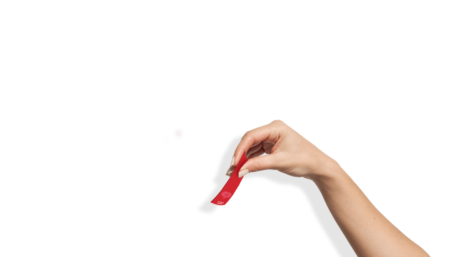
I worked on paper as flyers, big and little posters, business cards for candidates (traditional used here).
I designed a website with made by a web developer, and I did all graphics for social campaign.
I also did some motion graphics and video post production for campaign videos.